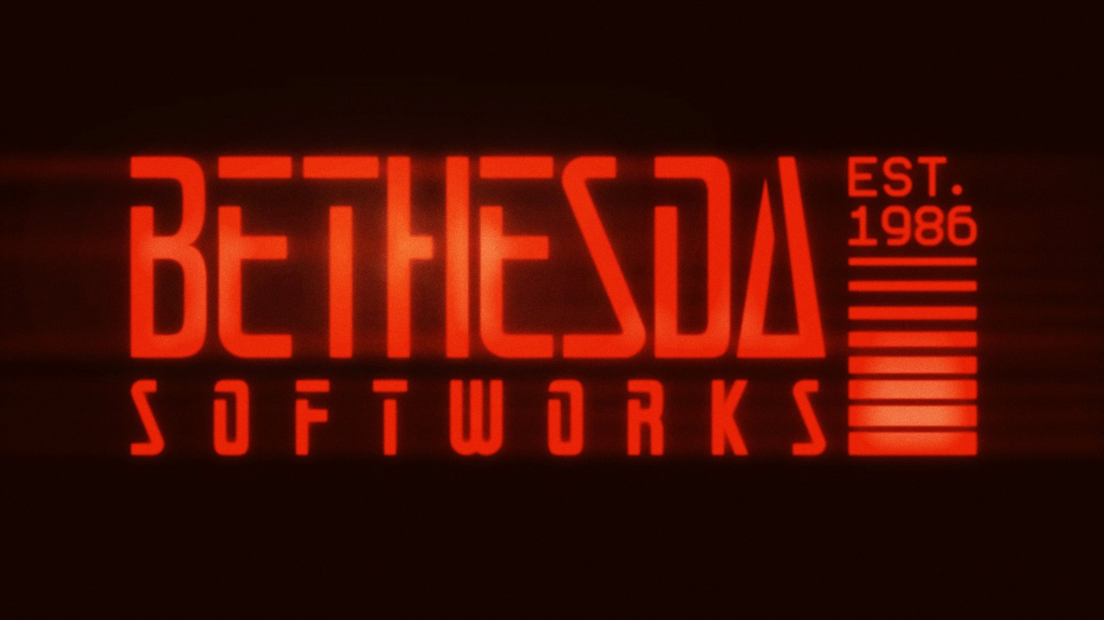
Bethesda Softworks has unveiled a new cyberpunk-inspired logo as part of its 40th-anniversary celebrations, replacing its familiar minimalist presentation for the occasion. The sharper type, high-contrast colours, and decorative details give the publisher branding considerably more personality, although its long-term future remains uncertain.
GameSpot’s report on the new Bethesda logo describes it as a substantial visual departure from the designs the company has used over the past 25 years. Bethesda has presented the mark as an anniversary identity rather than explicitly confirming a permanent corporate rebrand.
Why did Bethesda change its logo?
Bethesda says it introduced the new logo to celebrate 40 years in the games industry and draw inspiration from its roots.
“40 years of adventures. Here’s to the worlds we’ve built together… and those still to come. We’re marking the occasion with a logo inspired by our roots,” the company wrote in its official announcement on X.
The company did not explain which specific parts of its history informed the design. Its cyberpunk styling is therefore a visual choice rather than evidence of an unannounced game, and Bethesda has not connected the logo to any particular project.
The appearance contrasts sharply with the publisher’s previous branding. Bethesda’s earlier identity paired straightforward lettering with a splash of colour, before a 2010 revision removed the coloured elements and the word “Softworks” from the mark. The resulting black Bethesda wordmark remained deliberately plain.
Is Bethesda’s new logo permanent?
Bethesda has not confirmed whether the new logo is permanent or limited to its 40th-anniversary celebrations.
The announcement calls it a logo created to mark the occasion, but does not provide branding guidelines or describe it as a lasting replacement. Until Bethesda uses it consistently beyond the anniversary campaign or issues a clearer statement, it is safer to treat it as an anniversary identity.
That uncertainty does not diminish the scale of the visual change. Bethesda Softworks has used variations of the same restrained branding for roughly 25 years, making the angular lettering and brighter palette a clear break from its recent corporate presentation.
Which Bethesda logo has changed?
The new design belongs to publisher Bethesda Softworks and does not replace the separate Bethesda Game Studios logo.
Bethesda Game Studios is the internal developer associated with The Elder Scrolls, Fallout, and Starfield. It uses a different identity featuring a stylised cog behind its name, and there is no indication that this studio logo has changed.
The separation is easy to miss because both organisations share the Bethesda name. The publisher identity can appear across games released under the wider Bethesda label, while the studio mark identifies projects developed by Bethesda Game Studios itself.
The anniversary branding also arrives while Bethesda is discussing several future projects, but the logo announcement establishes no direct connection to them. Our sister site IGN Middle East has separately covered Bethesda’s current development roadmap, including Fallout and The Elder Scrolls projects. For the moment, the redesigned mark is best understood as a celebration of the publisher’s history rather than a product reveal.